Monday, June 10, 2013

Final Project

      For our final project we had to choose a theme and capture it in an unusual way; to represent something bigger on such a plain scale was quite the challenge, but I picked something we use and see everyday: our hands. Every second of our lives our hands are in motion. We play, work, and feel with every finger. When you look at them for long enough, hands can seem pretty weird, with a piece of calcium growing at the tips, and wrinkles formed at every crease. I decided to represent a world-theme with each image I captured and edited, and without further-ado let's see what I did.


#1. On the Inside
The first picture I decided was going to show what I learned independently in class. I used my knowledge of the liquify tool, and the many strategies for saturation gradient to create this mix-up. Taking a shot of every side of my hand, I had one meaning in mind: Our experiences and knowledge are what makes us different; this is shown by a different color coming out of every hand that looks near the same.


#2. Anonymous
My second piece of the collection centered on lighting, placement, and contrast. I wanted to use the sun to create a shadowy outline of my muse's fist. By facing the sun and moving back a bit, the angle formed a "rule of thirds"-esque photo, which I proceeded to edit. The color red represents violence, power, and blood; the hand represents us, and I wanted to use it effectively. The theme of the photo revolves around revolution, it is: Violence exists in all of us, no matter how we look or act.


#3. With Passion
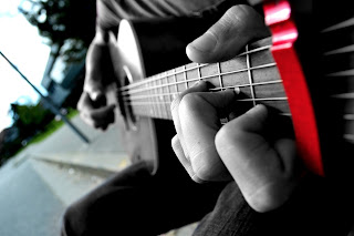
With my third photo, I was searching for something I could use to represent actions and the things we can do with our hands. At the same time I wanted to be able to use some things I learned, like focusing, angle, and selective color. The picture turned out nicely, the fingers sharp and clear while the rest remained blurred. The theme of this image is: No matter how odd and out of place we are, our actions speak for us.


#4. Holding Ghosts
Hands may aslo signify a connection of sort. The fourth image in my collection was an example of a technique called "ghosting" where using opacity and image manipulation you make something look like a poltergeist. I played with the idea of holding hands, but in the end tree-hugging won, then using the rule of thirds I placed each symbol appropriately. The hands would be in the center, signifying something being held, maybe a relationship, maybe a memory. On the right I placed my "ghost" to symbolize something that wants to move on, something that can't be held.

#5 Unusual Flare
The fifth photograph was actually an accident. I know a cool trick with my hands that make it look like a serpent of some sort, and playing around I managed to get something totally strange, a fire breathing hand dragon. Coming up with a theme was nigh impossible, but it was there. Our imagination gets the better of us.


#6. Alienation
The sixth and final picture I made was a combination of different techniques. I used focus, collage-ing (taking multiple pictures and piecing them together) and various blending strategies. For my last image, I really wanted to capture our hands in an unusual environment, somewhere completely unexpected, and it turned out to be the ground. I used a bit of personification to make the hands look beast like, perhaps aliens, and this is what strengthened my overall theme of this body part being completely different for what we take it for.

Ending Note: It's been a successful and interesting semester in photography, I really enjoyed working with my teacher and my fellow peers, adieu. 

Wednesday, March 13, 2013

Infrared Photography

My third assignment is Infrared Photography.

To start off, we had to research and find out what it was, being the pleb I am, I used google and clicked the first link.

http://en.wikipedia.org/wiki/Infrared_photography

So far, I've learned that the infrared wavelengths lie in-between microwaves and visible light, (which is then followed by ultraviolet.) Infrared photography is putting a filter that blocks all but infrared light to the camera lens.  The original creator was Robert R. Wood, in the beginning of the 20th century.

To start off, I realized that I had no filters for the lens available, so all of that effect would have to be done post-shoot. I continued my project by googling "Infrared Photoshop Effect Tutorial" and came up with two promising websites:

http://www.photoshopessentials.com/photo-effects/infrared-photo/

http://photo.tutsplus.com/tutorials/post-processing/creating-an-infrared-effect-to-photos-using-photoshop/

I went out and took multiple photo's of Graffiti, then continued to try each effect on a separate image.

1.  http://www.photoshopessentials.com/photo-effects/infrared-photo/

After and Before


The first image is the one with the effect applied. After playing around in photoshop I didn't notice much of a difference, so overall I was not impressed with the tutorial, although it did enhance the colours of the photo.

2. http://photo.tutsplus.com/tutorials/post-processing/creating-an-infrared-effect-to-photos-using-photoshop/

After and Before


I was more pleased with how this one turned out. Still curious as to if I could improve just a bit more, I decided to mix the two techniques together...

3. The mix. I used the first process to greatly improve the colour and contrast, then I used the second one after to give it that darker infrared feel.

After and Before

In the end, I learned quite a bit of the channel mixing technique. I also found out that there are many ways of achieving an end result and that you should always strive to increase your personal arsenal of photo editing skills.

Tuesday, March 5, 2013

Erik Johanssen Inspired Photo Collage

Erik Johanssenn Inspired Photo Collage

For our second project we had to choose an assignment (out of the three available) and I picked the Photo Montage, which is where you take a random assortment of pictures and combine them in a photorealistic piece.

These were a few of what I picked out: 

As you can tell the theme was mainly animals.

After around four hours of total work I produced this, I really didn't plan much so it didn't turn out as well as it could have.


Friday, February 22, 2013

Coin Theme Objects

This is my "coin" themed photo shoot. I used these snapshots I took to play around with tools on photoshop.

I concentrated on achieving texture in this one. With some nice contrasting, the spinning nickel looks almost golden.


Above: A nice focused shot on the floor of three coins supporting each other and a bit of desaturating gives this picture a lonely feel while emphasizing on how much unity is needed to achieve balance.

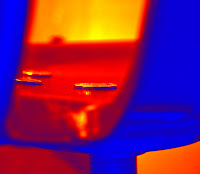
Left: Wanting to go for a more "modern" look, I decided to do a "stalking" shot of some coins sitting and then to add in a thermal filter.


Left: This picture was more of a product of my frustration with keeping the object up; honestly, it was a pain in the rear. After a few unsuccessful attempts I noticed by quickly uncovering the lens the quarter seems to shine bright, like a diamond. Nicki Minaj reference right there.

Below: That messy blob in focus is a Looney spinning, looks cool.

Tuesday, February 12, 2013

Hockney Project

This is my David Hockney themed montage. I was inspired by his painting-like editing and effects on his photos that give them an almost mosaic feel. After studying his work for a bit, I decided my favourite was the Merced Valley because of it's unusual complexity. I went out and grabbed a caution sign; I wanted to contrast the common grey weather I have in my area to the vibrant yellow of the plastic. Being able to put it in a collage allowed me to capture this entire courtyard, and although life may seem dull sometimes, just like the sign we have moments of risk. Further more, by using yellow to compliment the grey, it gives it a relaxing feel instead of the boring effect plain colours usually have. To top the picture off I used a "poster" filter in photoshop to give it a rough and edgy look.

Merced Valley - http://www.hockneypictures.com/photos/photos_collages_02_large.php

Photo Credits to Martin Birchenko